Donmai

Danbooru 2 upgrade on Feb 16, 2013

Posted under General

Schrobby said:
That said - what is the gain of name changing?

Making myself less Google-able. But, then, my own fault for screen name habits.

As for complaints(?), when I view the site in Opera on iOS 6, the tag's wiki is open and posts are listed in one column. I haven't checked, but unless it's changed, there aren't any "pending" borders around the posts, either.

flynch said:
No problem, what's the small mode just out of interest?

Something that made my experience much nicer. It used to live here:
http://userstyles.org/styles/35130
...but it looks like Userstyles nuked everything for Danbooru? What th...Oh for fuck's sake:
http://forum.userstyles.org/discussion/33624/x/p1

What it did was shrink things down and made the top navigation a fixed float icon at the top left that expanded on hover. More importantly, it did similar for pools at the top right. Basically, it made traversing pools (reading comics) a lot more pleasant and let you devote maximum vertical screen real-estate to the images and tags. I think it may have had other things to?

I haven't even looked at making it work again yet because I'm pretty much in hover mode until the dust settles and I can actually get completion for post editing and uploading (at least. Those are the big ones).

After the upgrade I keep getting the "something broke" error with the date:2008-01-01...2008-06-06 chartags:1 -1girl quiery (insert any date, nothing changes). Before I added -1girl everything was ok. Btw, is it supposed not to show the exact amount of pages if it exceeds 1000?

flynch said:

I've got one at the moment if you want it, It's not just black though I made a lot of changes to some pages. It's also really soon like you said, I don't know if I caught everything in it. But here (kind of rough):

http://imgur.com/a/n7NAS
http://pastebin.com/b6ZPq7Uc

Edit: Yeah I missed a bunch. Updated it if you still want it.

I love this but i have a problem and i was wondering if you could help me with it.

All the text in note boxes blends in with the background and makes it impossible to read anything, and i want to know if it's just something with me or what.

TheHunter said:
I love this but i have a problem and i was wondering if you could help me with it.

All the text in note boxes blends in with the background and makes it impossible to read anything, and i want to know if it's just something with me or what.

Oops. Yeah I only just put it together today so I'm sure I've missed a few other things things too. Here this one has the notes coloured:

http://pastebin.com/9xehdR81

Not sure if this has been reported yet, but for Opera, which is the browser I use for Danbooru, there's been some odd formatting errors under the current Danbooru 2.

http://notoneofus.com/images/danbooru2-formaterror01.jpg

Here, the top bar won't go away despite clicking close. Additionally, the flagging reminder is not only stuck to the side, it'll overlap images that are wide enough.

http://notoneofus.com/images/danbooru2-formaterror02.jpg

The bottom half of a post is also noticeably different and cluttered here than it is under, say, Firefox.

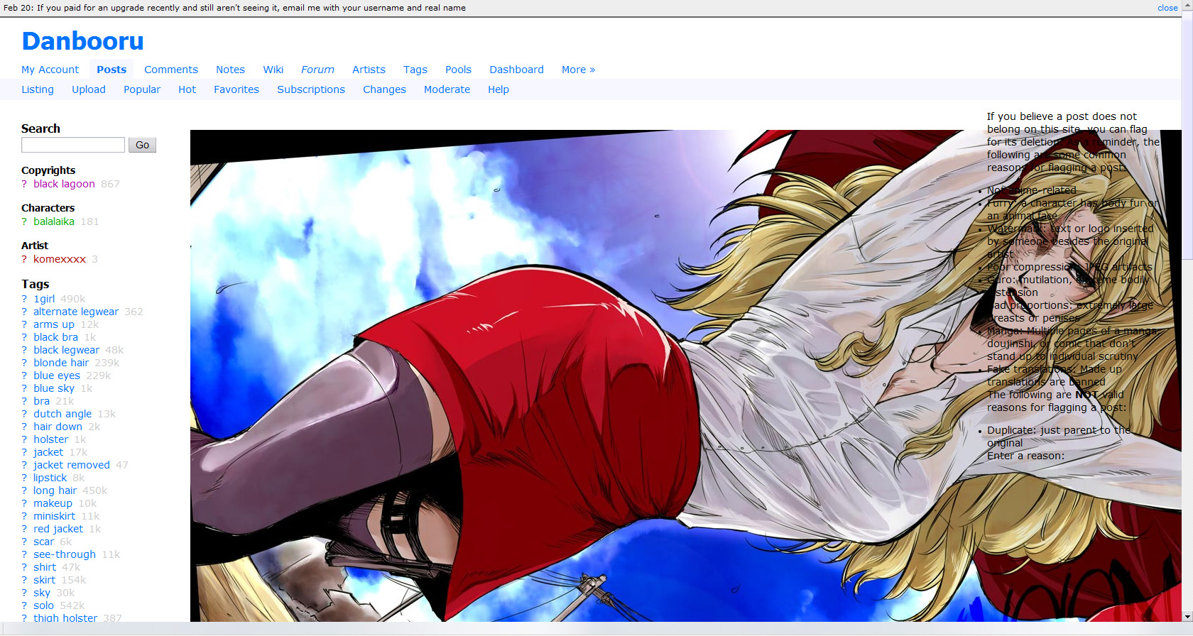
While it's probably unnecessary given the length of this thread, hopefully some more input won't hurt.

Above anything else, this new upload queue system seems incredibly counter-intuitive. I understand that many problems still need ironing out, so more minor details will just take getting used to, but even conceptually I don't understand what this is supposed to accomplish.

In the first place opening the pending status page in a new tab just leaves the original upload tab as a useless extra, and either way, having that instead of an immediate direction to the completed post doesn't present anything that we would be unable to see after the fact.

I can't speak for anyone else, but personally I like to at at least quickly review a post after uploading, to see if I made any typos or blanked on any important tags, which becomes a very tedious process with the use of this system. Not to mention attempting to connect parent and child posts in quick succession.

A lot of this might not even be as bad if the queue moved at a decent speed, but from what I can tell any somewhat large upload or busy period has the potential to completely clog everything up. If that were less of a problem, the general concept could be just a minor annoyance at worst.

I'm trying not to come off as against the site upgrade in general, aspects such as the tag separation in posts feel like a natural progression, but uploading has almost become a chore these past few days. I enjoy trying to contribute to the site and showing support for series and artists I like, but it just isn't always feasible to wait an hour or ten in order make sure I typed something correctly.

I noticed on the wii's internet browser, I can't see the notes on translated images. This a common issue with other devices that can browse the web? Admittedly the wii's browser has always been shit but it only after the change that this became an issue.

Type-kun said:
Bugs aside, we really need a place to debate about changed features. Like pool positioning, username changes, inability to see status:deleted etc. This thread is a mess, and github comments on closed issues are likely to get missed.

Creating new threads for each separate issue, or group of related issues, is probably the way. At least that how we usually dealt with such things in the past.

(re: Small Modo style)

DschingisKhan said:
What it did was shrink things down and made the top navigation a fixed float icon at the top left that expanded on hover. More importantly, it did similar for pools at the top right. Basically, it made traversing pools (reading comics) a lot more pleasant and let you devote maximum vertical screen real-estate to the images and tags. I think it may have had other things to?

Anything else it did fell under the same basic heading (maximising screen real estate for the actual images); there were Greasemonkey scripts for the really swish things (like being able to toggle sidebar sections between collapsed and expanded), but Small Modo was just CSS.

I'm not much of a contributor (and I can't remember who wrote it originally, with the UserStyles page being gone; forum search isn't finding the previous mentions), but I do use Small Modo extensively, and I know CSS well enough to write some of my own tweaks into it. I won't have time to work on it until the weekend, but if no-one else has updated it by then, I'll happily take it on.

(Good news: in brief investigation, the HTML structure for Danbooru 2 is much more amenable to picking out individual sections for CSS fiddling. I know that was one of the goals, and it'll certainly be useful for restyling wrappers like this.)

1 23 24 25 26 27 28 29 30 31 48